
Well, Persona 5’s English version got delayed. It’s unfortunate, but it sounds like Atlus is really going the extra mile with this one, and they’re going to make the original Japanese audio free to download as DLC, so I think lots of people will be happy about that. I finished the game myself about a week ago, and it really is fantastic – if you liked 3 and 4, you’ll definitely enjoy this one. Anyway, here’s a translation of a fairly recent Famitsu column where Sakurai talks about Persona 5 and UI in video games. Big thanks to PushDustIn for editing help. Enjoy it!
Note: Do not repost the full translation. Please use the first two paragraphs and link to this translation.When reporting on this translation you must mention that it was translated by Source Gaming. For additional information, please read this post. This translation is for fan use only, and may not accurately reflect the opinions of Masahiro Sakurai. The following is a selection from Famitsu. If you enjoyed this article, I would strongly encourage you to support Sakurai by buying his books.
Source Gaming does not run ads on its website. If you enjoy our translations, please consider donating to our Patreon. It helps us afford new things to translate!
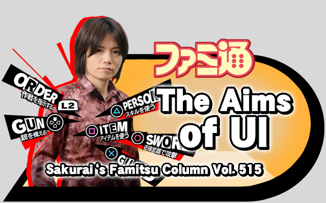
The Aims of UI
Originally published in Famitsu Vol. 515, 6 October 2016
In Persona 5, the character illustrations are great! The game’s systems are great! The music is great! The monster designs are great! The environment is great! The story and dialogue are great! Lots of things are great! It’s a very strong game, so I’m sure many people are enjoying it. But personally, it takes an awful lot of time to play… For a working adult, the toughest part of any game is actually finding the time to play it.
Persona 5 is full of strong points, but the one that I feel stands out far above the rest is the “GUI,” which stands for “Graphical User Interface.” A thorough explanation might get rather difficult to understand, but in short, it’s stuff pertaining to the menus. In a broader sense, it also includes things like subtitles, the in-game time and HP displays, and other information arranged on the screen. “GUI” is usually shortened to just “UI” in the industry, so that’s what I’ll use below.
If you take a look at Persona 5’s UI, you’ll immediately understand what makes it special. As opposed to Persona 4, which used a vivid, largely yellow design, Persona 5 goes for a black-and-white theme and strongly features the color red. The design makes heavy use of character portraits and 3D models, and their gorgeous yet speedy movements create a stylish composition that’s fun to watch. By taking an active role in the game’s presentation, I think that Persona 5’s UI draws a line distinguishing itself from the UIs of typical games up until now. Honestly, it’s to an extent that once you get used to this, the average game’s UI will look out of date.
Essentially, UIs are set up to be rectangular. They are “drawers.” Because computers store a lot of complex information, the UI is a structure that’s used to designate, retrieve, and display whatever information is needed. So to a certain extent, if the UI isn’t arranged neatly, it can be troublesome. In that sense, Persona 5’s UI is unconventionally cluttered. If you don’t get familiar with it, you’ll sometimes run into situations where you can’t quickly do the things you want to do.
And the tough thing is, they also have to put together the international versions of the game. If characters are displayed in an area that has a unique size, that won’t work well [for other languages]. For example in English, usually character size gets smaller while sentences grow longer. Because of that tendency, it becomes hard to fit all the necessary information in a UI of the same space.
However, the team was able to overcome these challenges to create a UI that works well for the player and still maintains the game’s unique flair. After all, for the player, hardships on the production side are irrelevant.
If there was a game UI contest held tomorrow, Persona 5 would probably win by a mile. It’s magnificent.
On the other hand, there’s another game with a UI that I think highly of for a completely different reason: Pokémon GO. Its UI is astonishingly plain and simple—the complete opposite of Persona 5’s.
Most monster collecting games on smart devices tend to be rather cluttered. Pokémon GO breaks the mold, however, sacrificing almost all decoration in favor of simplicity. Given that the game is enjoyed by a wide range of players, opting for a more accessible design was the right decision.
The concept of “CP” is a great idea, as well. This is a numeric value that represents a Pokémon’s strength. Essentially, CP is an elegant way to summarize traditional parameters like Attack and Speed. Additionally, information like a Pokémon’s weight and height are displayed, which adds to the feeling that these Pokémon are living creatures. It’s a subtle touch, but it perfectly captures the game’s concept.
Each UI has a different aim: to expand the world, to add personality, to make it easier to play, or to put everything together elegantly. You can’t simply say that being hard to use makes a UI bad. As technology advances, that may open the way for new possibilities in UI design.
- Tokyo Game Show 2025 Previews #3: Itachi: Haunted Abodes, Digital Exorcist, Time Flies, and MotionRec - October 13, 2025
- Tokyo Game Show 2025 Previews #2: Professor Layton, Katamari Damacy, Marvel Tokon, and Nioh - October 11, 2025
- Tokyo Game Show 2025 Previews #1: Pragmata, Resident Evil, Onimusha, and Yakuza - October 6, 2025